Beispiel:CSS-mehrspaltige Layouts-5.html
Aus SELFHTML-Wiki
<!DOCTYPE html> <html lang="de"> <head>
 <meta charset="utf-8">
 <meta name="viewport" content="width=device-width, initial-scale=1.0">
<link rel="stylesheet" media="screen" href="./Beispiel:Grundlayout.css">
 <style>
.grid {
 --n: 3;
 display: grid;
 max-width: 20em;
 gap: .5em;
 border: medium dashed #337599;
 margin-bottom:1em;
} .horizontal {
grid-auto-flow: column;
} .grid img:first-child {
grid-area: span var(--n) / span var(--n);
} img {
 width: 100%;
 height: 100%;
 object-fit: cover;
}
 </style>
 <title>Bildergalerie</title>
</head> <body>
Bilder-Galerie im Grid Layout
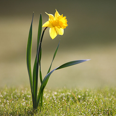
   <img src="https://wiki.selfhtml.org/images/f/f1/Frühling.png" alt="Bild einer Narzisse, Quelle Wikipedia">
   <img src="https://wiki.selfhtml.org/images/f/f1/Frühling.png" alt="Bild einer Narzisse, Quelle Wikipedia">
   <img src="https://wiki.selfhtml.org/images/f/f1/Frühling.png" alt="Bild einer Narzisse, Quelle Wikipedia">
   <img src="https://wiki.selfhtml.org/images/f/f1/Frühling.png" alt="Bild einer Narzisse, Quelle Wikipedia">
   <img src="https://wiki.selfhtml.org/images/f/f1/Frühling.png" alt="Bild einer Narzisse, Quelle Wikipedia">
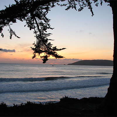
   <img src="https://wiki.selfhtml.org/images/8/8f/Sommer.png" alt="Sonnenuntergang am Strand, Quelle Wikipedia">
   <img src="https://wiki.selfhtml.org/images/8/8f/Sommer.png" alt="Sonnenuntergang am Strand, Quelle Wikipedia">
   <img src="https://wiki.selfhtml.org/images/8/8f/Sommer.png" alt="Sonnenuntergang am Strand, Quelle Wikipedia">
   <img src="https://wiki.selfhtml.org/images/8/8f/Sommer.png" alt="Sonnenuntergang am Strand, Quelle Wikipedia">
Dieses Beispiel verzichtet auf feste Angaben von Spalten und Reihen. Über eine custom property wird nur die Größe für das erste Bild festgelegt: grid-area: span var(--n) / span var(--n);
</body> </html>

