Beispiel:Clip-path-6.html
Aus SELFHTML-Wiki
<!DOCTYPE html> <html lang="de"> <head>
 <meta charset="utf-8">
 <meta name="viewport" content="width=device-width, initial-scale=1.0">
 <link rel="stylesheet" media="screen" href="./Beispiel:Grundlayout.css">
 <title>Beschneidungen mit clip-path, animiert - 6</title>
<style> body { background: black;} h1 { color: white;}
img {
 width: 100%;
 height: auto;
 clip-path: circle(5% at -5% 50%);
 animation: reveal 15s linear infinite;
}
@keyframes reveal {
 0% { clip-path: circle(5% at -5% 50%); }
 10% { clip-path: circle(22% at 6% 50%); }
 20% { clip-path: circle(13% at 17% 50%); }
 30% { clip-path: circle(13% at 28% 50%); }
 40% { clip-path: circle(13% at 39% 50%); }
 50% { clip-path: circle(18% at 50% 50%); }
 60% { clip-path: circle(13% at 61% 50%); }
 70% { clip-path: circle(13% at 72% 50%); }
 80% { clip-path: circle(13% at 83% 50%); }
 90% { clip-path: circle(22% at 94% 50%); }
 100% { clip-path: circle(5% at 105% 50%); }
} </style> </head>
<body>
Der „suchende“ Blick
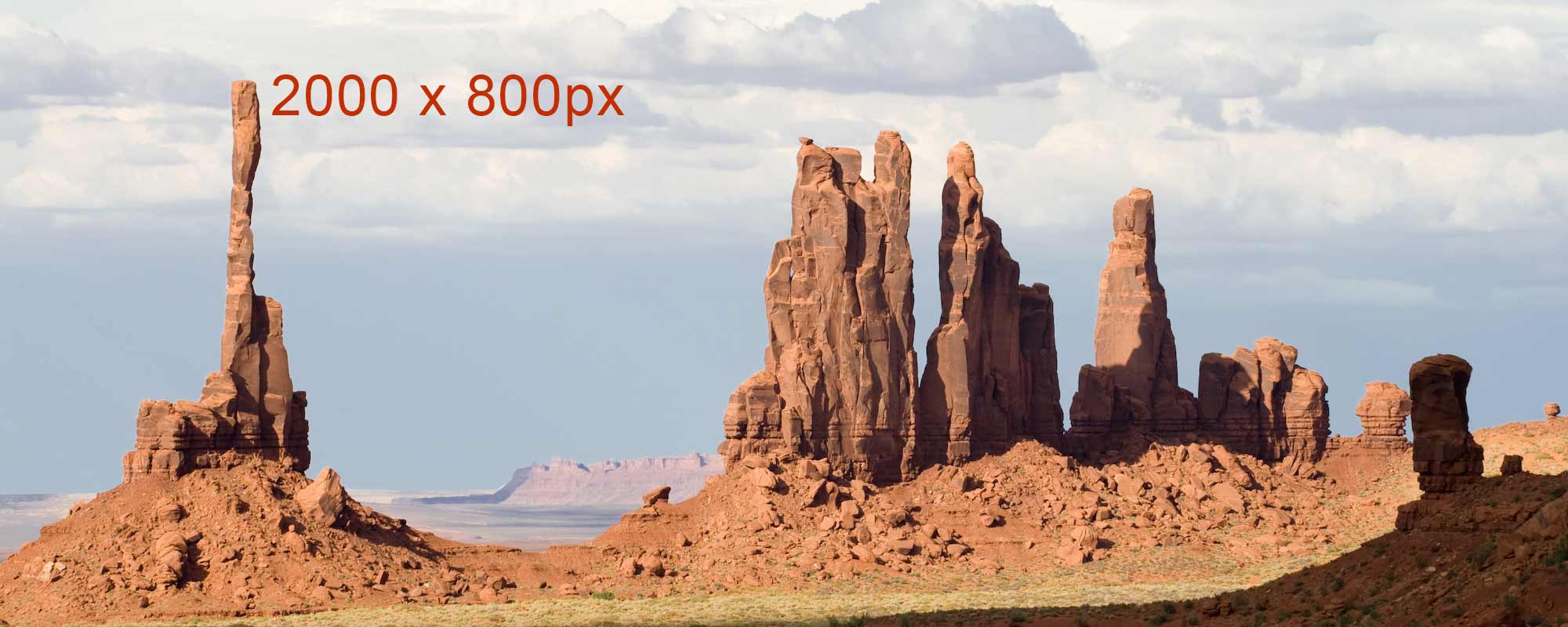
<img src="https://wiki.selfhtml.org/images/e/e4/TotemPole-2000.jpg" alt="Monument Valley">
</body> </html>