Beispiel:Hero-3-Art-Direction.html
<!DOCTYPE html> <html lang="de">
 <head>
   <meta charset="utf-8">
   <meta name="viewport" content="width=device-width, initial-scale=1.0">
   <title>Art Direction</title>
   <style>
     html {
box-sizing: border-box; }
*, ::before, ::after { box-sizing: inherit; }
     body {
       display: flex;
       flex-flow: row wrap;
gap: 1em;
}
     /* Mobile first - alle Dokument-Blöcke bekommen 100% Breite */
     h1, nav, nav a, article, section, aside, footer {
       border-radius: 0px 0.5em 0.5em;
       border: thin solid;
       padding: 1em;
       flex: 1 100%;
     }
h1 {
padding-left: 200px;
}
     nav, nav ul, nav li{
       margin: 0;
       padding: 0;
       border: none;
     }
     nav li {
       list-style-type:none;
       margin: .3em 0;
     }
     nav a {
       display:inline-block;
       width:85%;
       background: #fffbf0;
       border: 1px solid #dfac20;
       margin: 0;
       text-decoration: none;
       text-align: center;
     }
     nav a:hover {
       background-color: #dfac20;
     }
     section {
       background: #F1F3F4;
       border-color: slateblue;
     }
     article {
       background: #ffede0;
       border-color: #df6c20;
     }
     article img {
       width: 100%;
     }
     aside {
       background: #ebf5d7;
       border-color: #8db243;
     }
     footer {
       background: #e4ebf2;
       border-color: #8a9da8;
       display: flex;
       flex-flow: row wrap;
     }
     footer * {
       flex: 1 1 0%;
       justify-content: space-between;
     }
     footer p {
       text-align:right;
     }
     /* Smart Phones und Tablets mit mittlerer Auflösung */
     @media all and (min-width: 35em) {
     article {
       order: 2;
     }
     nav {
       flex: 1 auto 0%;
       order: 3;
     }
     aside {
     /* durch auto werden die beiden asides in eine Zeile gesetzt */
       flex: 1 auto 0%;
       order: 4;
     }
     footer {
       webkit-order: 5;
       order: 5;
     }
     }
    /* Large screens */
    @media all and (min-width: 50em) {
    article {
       /* Der Article wird 5x so breit wie die beiden asides! */
       order: 3;
       flex: 5 1 0%;
     }
     nav {
       flex: 1 1 0%;
     }
     aside {
       flex: 1 1 0%;
       order: 4;
       align-self: center;
       height: 200px;
     }
     }
</style>
</head> <body>
Art Direction mit picture
<nav>
- <a href="#link_1.html">Startseite</a>
- <a href="#link_2.html">Verlauf</a>
- <a href="#link_3.html">Geschichte</a>
- <a href="#link_4.html">Impressum</a>
</nav>
<article>
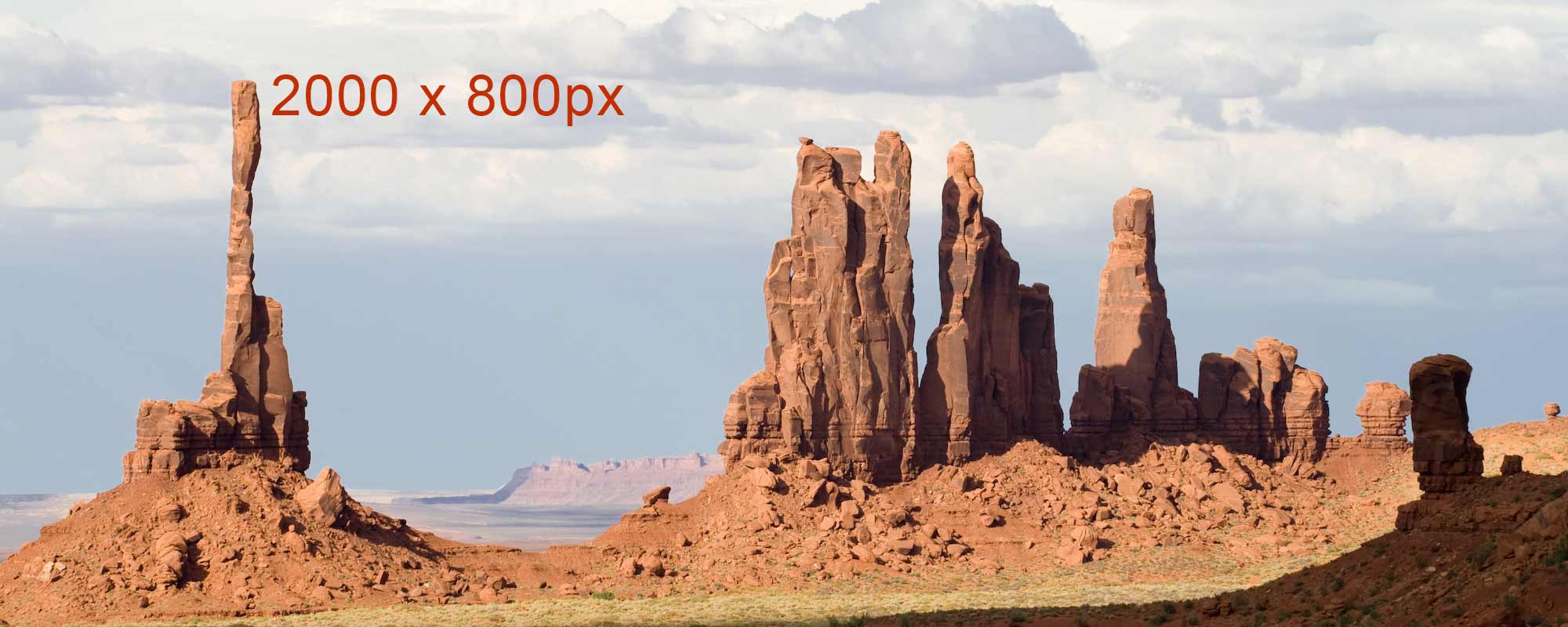
Monument Valley
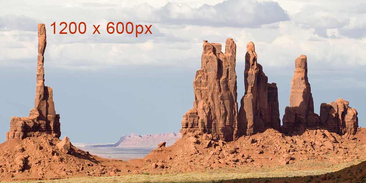
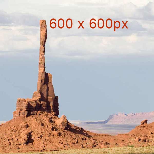
<picture> <source media="(min-width: 50em)" srcset="https://wiki.selfhtml.org/images/e/e4/TotemPole-2000.jpg 2000w, https://wiki.selfhtml.org/images/9/99/TotemPole-4096.jpeg 4096w" sizes="75vw"> <source media="(min-width: 30em)" srcset="https://wiki.selfhtml.org/images/2/23/TotemPole-1200.jpg"> <source srcset="https://wiki.selfhtml.org/images/c/c4/TotemPole-600.jpg"> <img src="https://wiki.selfhtml.org/images/e/e4/TotemPole-2000.jpg" alt="Monument Valley - Totem Pole"> </picture>
Das Monument Valley liegt in der Four-Corners-Region, an der Grenze zwischen Arizona und Utah,
und ist bekannt für seine Tafelberge.
Eines der berühnmtesten Panoramen ist der Totem Pole, eine an einen Totempfahl erinnernde Felsnadel.
Bildquelle: <a href="https://commons.wikimedia.org/wiki/File:USA_10315_Monument_Valley_Luca_Galuzzi_2007.jpg">File:USA 10315 Monument Valley Luca Galuzzi 2007.jpg</a> (Wikimedia Commons von Luca Galuzzi
 </article>

 <footer>
© 2016 by SELFHTML
</footer>
</body> </html>